The Pixar logo is one of every individual’s favourite childhood iconic logo designs. The logo generator, Pixar, has been the name behind famous animations, attractive phrases, and mind-staggering storylines of our youth. The iconic Pixar logo has become a global name since its invention in 1979. Since then, the company logo has gone through phases of development and evolution which contribute to the company’s rich history. In this article, we shall discuss the brief history behind the Pixar logo and the various phases of its progress.
A Chronicle of the Pixar Logo
In the beginning, the company was not the animation company for which it is famous in today’s world. It was a sales-oriented hardware company whose primary client was Disney studio. Pixar is the contributing source of some of the most popular animations and stories like the famous Toy Story and has done graphic designing and animating for renowned movies such as Monster Inc. and Light Year.
We are forever grateful to Pixar Studios for the unforgettable masterpiece which still fills our memories with nothing but happiness. Another significant feature of the company other than its movies is the logo. However, we must know that the Pixar logo has undergone three vast stages of evolution in its design. The years of development are briefly mentioned below.
- Evolution Between the Years 1976-1986
As we take the name Pixar, one thing that pops into our minds is the jumping lamp logo design which is iconic and classic. All three phases of evolution have given us three different Pixar logo designs. When the company was primarily established in 1979, the logo and the company’s name were nowhere in the picture for the first few years. The company was named “The Graphics Group” back then in 1976. They designed the logo of the Graphics group under the Lucasfilm subsidiary in 1978. It was a horizontally laid oval with another oval in black and red on the inside.
Both the parts of the pill were attached with the alphabet “C,” having a downwards face. The three-colored watermark written in capitals was located just above the emblem with “The” in white, “Graphics” in bright red, and “Group” in black, making it the topic of discussion of several groups. Under the symbol, an attractive tagline stating “The Art of Visual Communication” was written in black, while the word “Art” was red. It was a simple logo, yet, the combination of colors and the prominent tagline made it a topic of discussion among people.
- Development Between the Years 1986-1994
In 1986, Steve Jobs purchased the company from George Lucas for $5 million. He changed the company name to its current name, “Pixar,” and the logo was renewed. The new graphic design inspiration for the logo was by Apple BSD computer, which stands for Beveled Square with a Dent. It was a square-shaped emblem with frames on both sides and a hole right in the middle.
This design made the company’s name stand at the bottom of the emblem, separated by small black dots. It was in an elegant serif typeface, Trajan Pro Bold. Although the new design was much better than the previous one in terms of style and the message it sent, the evolution of the Pixar logo did not stop there and continued further on.
- Modification From the Year 1994 till Today
The classic logo design that John Lassiter designed was creator in 1994. The logo was further redesigned by Pete Decoy, an employee working in the company back then. His goal in making the new logo was to create a typography that would stand out from all the others. The new brand logo is in serif font style. The letters R and have a tail at their tips which is a unique concept and can only be noticed when observed closely. The logo first appeared with Toy Story and immediately became a trademark.
The History of the Pixar Lamp
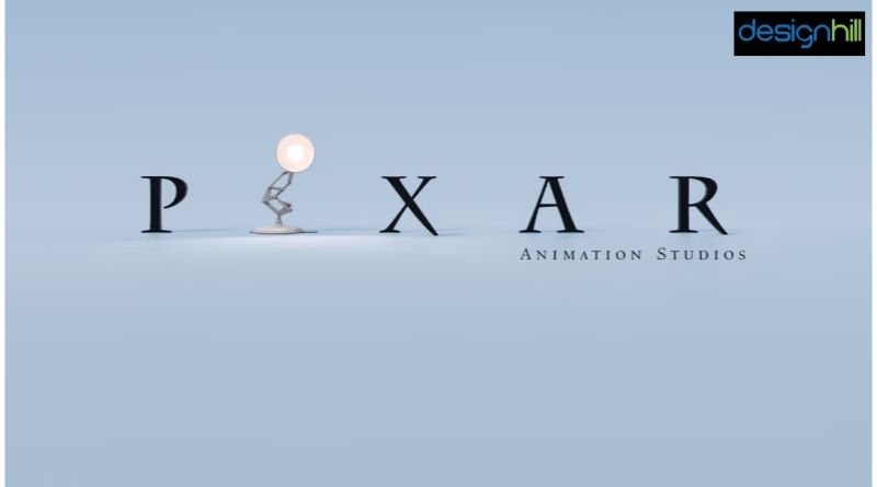
All massive Pixar movie fans cannot miss the beginning of any movie premiere under the banner because of the famous jumping lamp that features the Pixar logo design and Luxo Jr., the company’s mascot. The lamp, which bounces and appears on the screen, squashes the “I,” which is a name. In 1995, Pixar decided to alter the letter I for Luxo Jr. The most exciting part is that Luxo Jr. was the first animated film by Pixar studios in 1986. There are several other anniversary emblems for the 20th and 25th anniversaries of the famous film studio. Still, the Luxo ball and the Luxo lamp Jr. are the most famous objects in the Pixar universe. The Luxo ball was first introduced in Toy Story in Andy’s toy basket. After its debut, the Luxor ball is present in 15 of the 17 movies made by Pixar so far.
Another object more prominent than the Luxo ball is the Luxo Lamp jr. The lamp appears with the famous logo and is visible until the letter deflates. The appearence of the lamp has been the most recognized brand in all Pixar films for a very long time. You may not have known that the Luxo ball and the Luxo lamp are related. In the first movie, which is Luxo Jr., the plot is simple. Two lamps, named Luxo senior and Luxo Junior, are playing with a giant rubber ball. As Luxo junior attempts to balance the ball, it bursts, and then Luxo junior finds a bigger ball to assist in his game.
Initial Appearance of the Pixar Lamp Logo
Initially, Luxo Lamp jr. made an appearance with the Pixar logo. The first Pixar movie Luxo Jr. debuted at the SIGGRAPH Conference. It was a major event in the history of the logo generator, Pixar studios, because of how unique it was at the time of release. A breakthrough in the field of computer-generated imagery, the moving lamps and the way animators brought them to life made it a standout creation of its time. Pixar gave life to animated objects through its story and animation in a commendable manner, and the same was true for The Cars and Toy Story. The movie brought the first limelight to the company and its logo presentation in movies.
Font, Style, and Color of the Current Lamp Emblem
The center of Pixar’s corporate identity is Charlemagne Std-Bold with extended serifs. The logos with gray lamps and blue backdrop are most commonly used. The authentic color is black and white. A distinctive feature of the Pixar logo is how the bottom serifs are arched. The font, creatively made by Carol Twombly between 1989-2002, was first published by Adobe.
Conclusion
The Pixar Logo and its animation sequence that come to the screen during Pixar movies always bring a smile to our faces. The company excelled as a logo generator, and its brand identity is an incredible work of art that has aged gracefully and continues to make the childhood of today’s youth memorable.


